Dark and premium without looking generated: glass cards, a violet and lime identity, mono numbers.
Eval suite not run yet
Every listing publishes its measured trigger accuracy, before and after.
See the catalogueFrontend standards
An app that feels like Apple shipped it: system colours, SF type, a real Mac window.
Trigger accuracy
Not measured yet. This skill does not go on sale until its eval suite has been run against it and the number published here.
An app window
> build the main window for a Mac clipboard manager with a sidebar and a list
Written to produce a 272px sidebar under an overlay titlebar, 13px controls, the arrow cursor, a sliding segmented control and one blue primary.
Its landing page
> now the landing page hero for that app
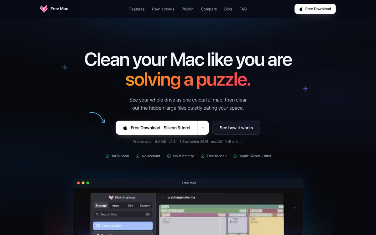
Written to produce a centred hero with a two-stop gradient phrase, a white pill download button, version and OS fine print, and the app in a window frame.
A fix
> this settings panel looks like a web page, make it feel like a Mac app
Written to shrink buttons to 12.5px, drop hand cursors and turn a solid red button into a tinted destructive one.
Dark and premium without looking generated: glass cards, a violet and lime identity, mono numbers.
Eval suite not run yet
Credible and expensive: paper and coal, a serif headline, mono money, one flat lime accent.
Eval suite not run yet